


Mobile First: Why Starting Small with CSS is the Key to Responsive Web Design
How to Increase Your Development Speed Using CSS Mobile-First Approach


As the world becomes increasingly mobile-oriented, it's no surprise that mobile devices are the primary means of accessing the internet. This shift has forced developers to rethink their approach to web design and development. One of the most effective strategies for creating mobile-friendly websites is the mobile-first approach to CSS. This approach involves designing and developing for mobile devices first and then scaling up the design for larger devices. By prioritizing mobile design, you can increase your development speed by writing less CSS code ( Yes you heard right! ). In this post, we'll take a closer look at why you should adopt the mobile-first approach to CSS and how it can help you create better websites for all devices.
Understanding HTML elements
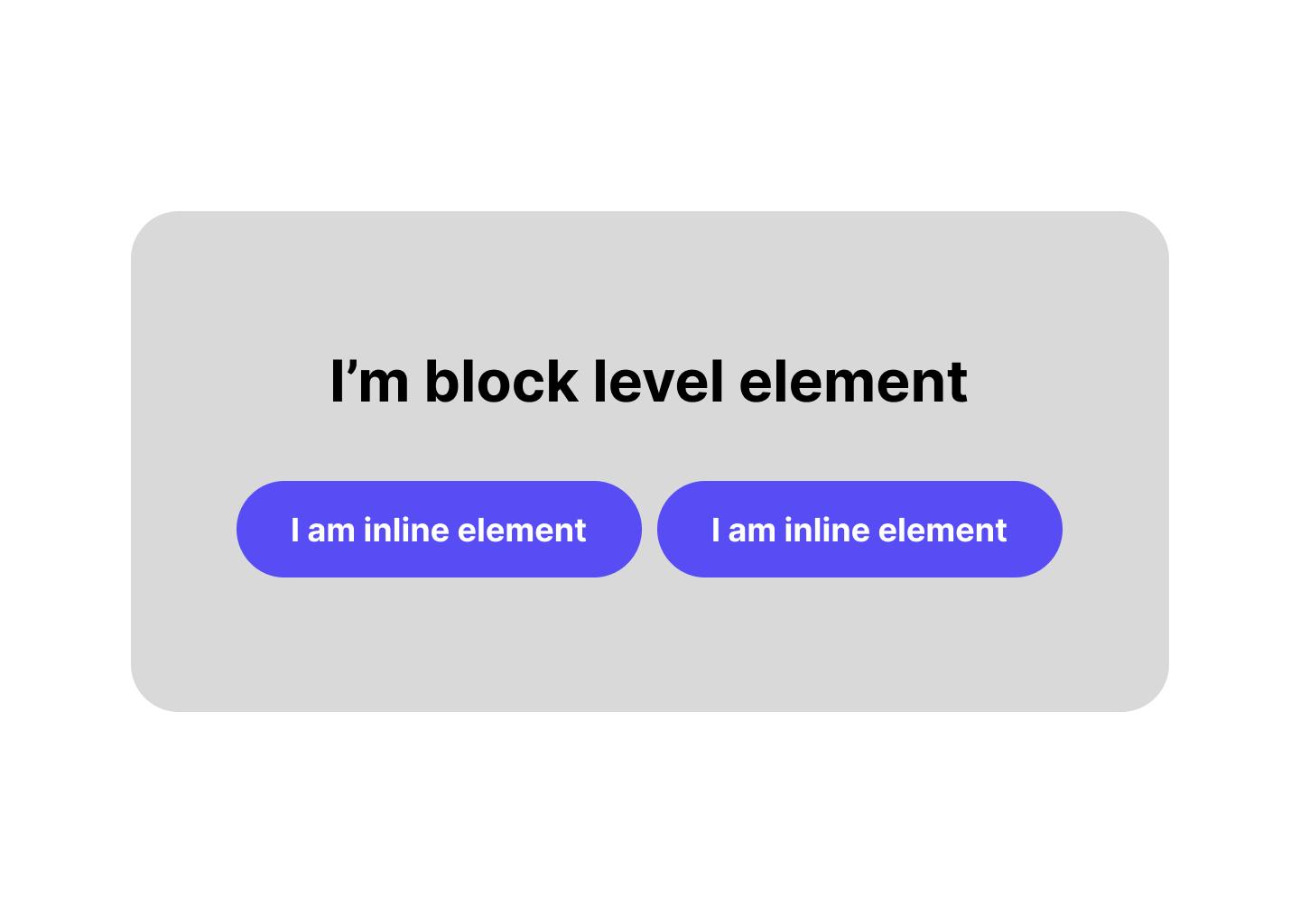
HTML (Hypertext Markup Language) is the foundation of every website. It's the code that makes up the structure and content of web pages. One important concept in HTML is the difference between block-level and inline elements.
Block-level elements are those that take up the entire width of their container and create a new line after them. They are typically used to create larger sections of content on a webpage, like headings, paragraphs, and lists.
Here are some examples of block-level elements:
<h1>to<h6>: Headings<p>: Paragraphs<ul>and<ol>: Lists<div>: Division or section of a webpage<footer>: Footer section of a webpage
When you use a block-level element, the browser automatically creates a new line after it. This is because block-level elements are designed to create distinct sections of content that are easy to read and navigate.
Now, let's talk about inline elements. Inline elements, as the name suggests, do not create a new line and are typically used within block-level elements to add additional content or styling. They are used for smaller chunks of content such as images, links, or span of text.
Here are some examples of inline elements:
<a>: Anchor or hyperlink<img>: Image<span>: Inline division or section of a webpage<em>: Emphasized text<strong>: Strongly emphasized text<br>: Line break
Inline elements are great for adding smaller, more specific details to a webpage, like links or emphasized text. They can also be used to modify the appearance of text within a block-level element.
It's important to note that block-level and inline elements have different default properties, including how they interact with each other. For example, you can't put a block-level element inside an inline element without some extra work.
Here's an example of how block-level and inline elements can be used together to create a nicely formatted webpage:
<div>
  <h1>Welcome to my Blog</h1>
  <p>Here's a paragraph of text about the topic of this blog post.</p>
  <ul>
    <li>First item in the list</li>
    <li>Second item in the list</li>
    <li>Third item in the list</li>
  </ul>
  <p>Here's another paragraph of text with a <a href="#">link</a> in it.</p>
  <img src="image.jpg" alt="A cool image" />
</div>
In this example, we have several block-level elements, like the <h1> and <p> tags, that create distinct sections of content. We also have an inline element, the <a> tag, within a paragraph to create a hyperlink. And we have an image, which is also an inline element, but it stands alone and does not modify the surrounding text.
Making use of HTML default behavior
On mobile devices, we display most items in Blocks. since there is simply not enough space on the screen. But as we scale up to bigger devices, we break those blocks into smaller pieces, since there is much more space available!
Look at the following example:
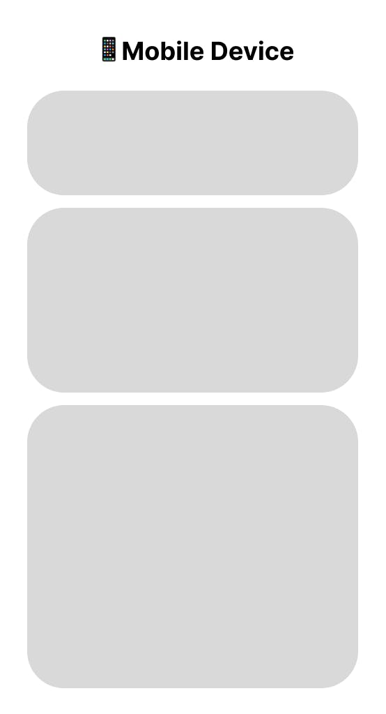
This is an example of how we show content on mobile devices. You can achieve this layout without writing any CSS ( or a very small amount of CSS ), now let's see the same layout on a Desktop:
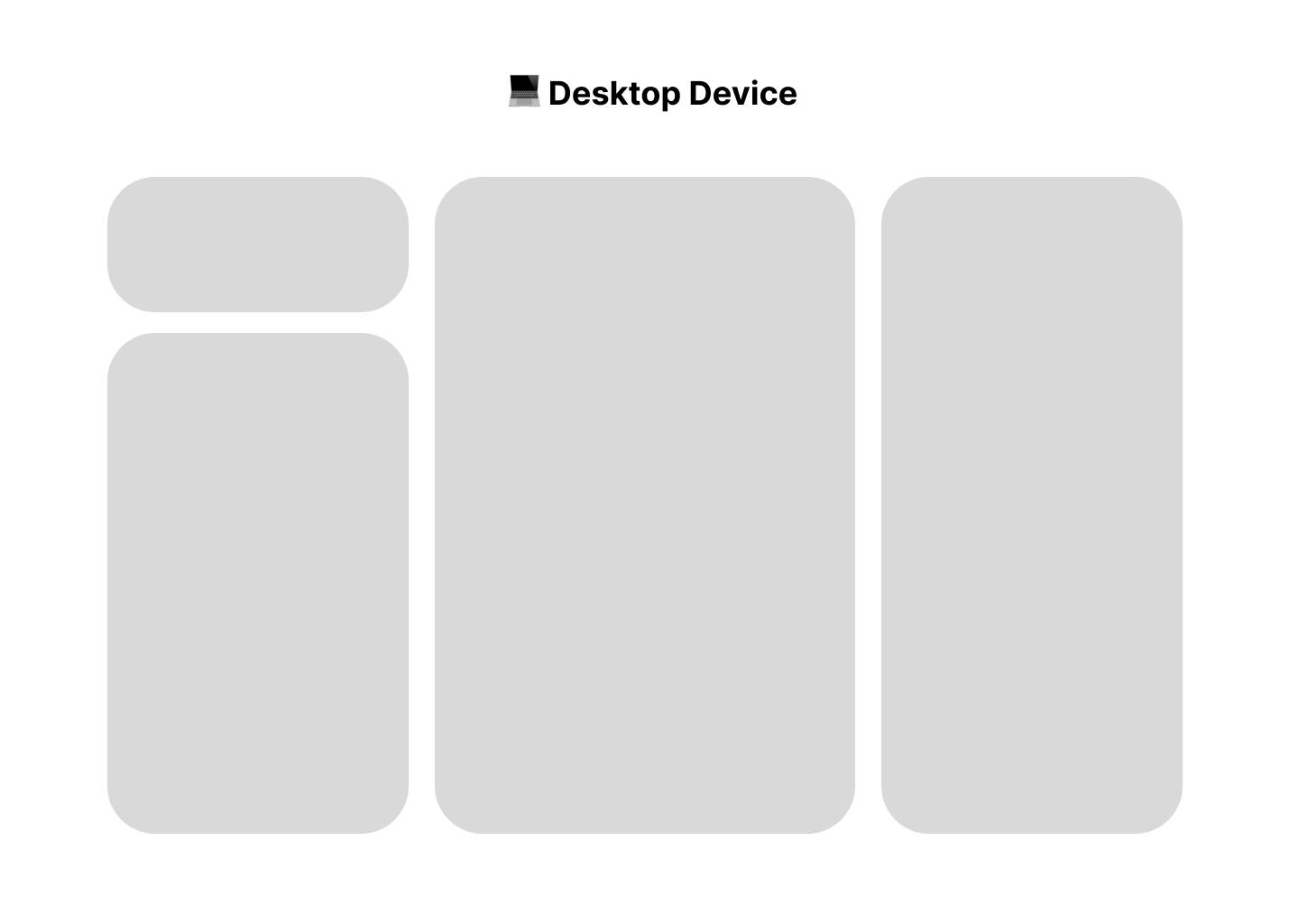
Now, as you can see we've broken things into inline elements using tools like `flexbox` or grid. And since we have access to more real estate on the screen, we might want to add more sections to our page!
With having Mobile-First mindset, you can display things properly on a mobile device with a few lines of CSS code. But what if we go Desktop-First?
Well, here is what's going to happen: You're going to write a lot of CSS codes and unnecessarily break things into smaller pieces to display them on a desktop, then you're going to write even more CSS code to stick things back together and display them properly on mobile.
What you should do instead is: You must take advantage of HTML block-level elements and make your website look good on mobile devices first. Then start using media queries and slowly make it responsive for larger screens. This way you'll increase your development speed by simply writing less CSS code, and also makes maintaining your CSS code much easier!
Conclusion
In conclusion, designing mobile first and then scaling up for desktop devices is an effective approach for creating responsive and optimized CSS code. This approach prioritizes the mobile user experience and encourages developers to focus on essential design elements and content first, before adding complexity for larger screens. By embracing a mobile-first mindset, developers can create more efficient CSS code that translates seamlessly across all devices, providing a better user experience for everyone.